Tacos El Chato
It was a Saturday in mid November of 2021, and my phone buzzed loudly from my desk. It was a call from a old high school friend that I had promised to catch up with a week prior. I picked up and we talked about how life had been treating us since the last time we met. At the time, I was in my last year of college, but I was still unsure with what I was going to do with the things I’ve learned thus far. To distract from my uncertainties of my own path, I asked about his family’s new taqueria, which he had mentioned the last time we spoke. He happily and passionately spoke about the successes his family was experiencing. However, he was running into some trouble with the branding of the business, since he didn’t have a hand at drawing. “I’m learning about branding right now in my class actually. If you’d like, I can try sketching out a few things?” I said with uncertainty and a lack of confidence in myself.
I was a new design student with little drawing experience, “How could I possible help?” I thought to myself.
Getting to Know the Reyes Family
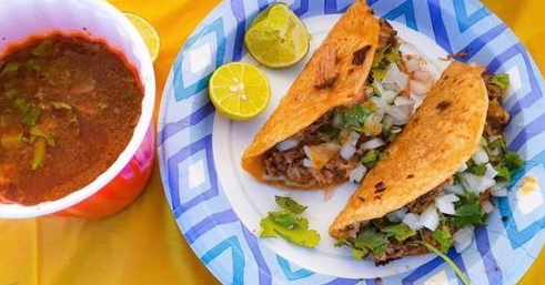
Tacos El Chato, founded and run by the Reyes family, started selling tacos and other home-cooked Mexican food off the side of the road in Gilroy, California during the COVID pandemic. They took a chance on their dream of starting a taqueria during a difficult time, but with hard work and dedication, their dream began to grow, and they noticed a new surge of hungry customers excited to try their food. However, they realized it would take more than just their delicious home-cooked meals to maintain their early successes.
Although I had limited experience with graphic design and little confidence in myself, their story motivated me to step out of my comfort zone and help a truly passionate family.In order to demonstrate to their customers that they are an established business, Taco El Chato requires a brand that symbolizes their family-run origins and their goal of providing authentic Mexican cuisine.
Before getting started, I asked him what words he would describe Taco El Chatos as a business. He wanted to maintain its humble origins and familiarity. We came up with a small word web that helped centralize the branding. We also looked at existing taqueria logos to get an idea of what he visioned.
He liked the more cartoony/character type logos, and wanted one of his father to honor him for starting and maintaining the business.
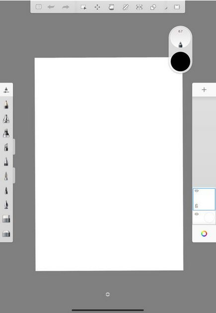
At the time, I didn’t have a lot of art tools or resources. However, I did have an IPad that I used to take notes on for school, so I did a bit of research on the best affordable drawing apps.
Getting started wasn't easy. I struggled with the learning curve that comes with digital art. With physical art, you have one piece of paper or canvas and whatever tools you wish to draw with. But with digital art, you have so much more flexibility and variety.
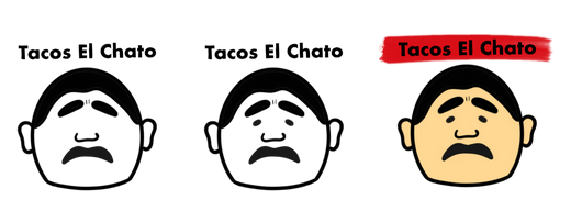

After hours of practice, I showed him two line drawings: one cartoon version of his dad and a simplified outline of a photo of his dad. To my surprise, he absolutely loved both, and he was especially excited about the simplified outline. In fact, he even asked for added details and color.
Truthfully, I didn't think I would get this far, but with my new found confidence, I got back to work, more inspired than ever.
I created several colored variations with differing text and image alignments to see which one matched the branding that he had envisioned. With some of his feedback, we finalized the logo that would soon represent Tacos El Chato.